20 KiB
Shapes
形について
Finally! We have been building skills for this moment! You have learned most of the GLSL foundations, types and functions. You have practiced your shaping equations over and over. Now is the time to put it all together. You are up for this challenge! In this chapter you'll learn how to draw simple shapes in a parallel procedural way.
ついにこの時が来ました!私たちはこの瞬間のために技を磨いてきたのです。あなたはGLSLの基礎を、型、関数についてのほぼ全てを身につけました。シェイピング関数も繰り返し練習してきました。今こそ学んだ全てを合わせる時です。この挑戦に受けて立ちましょう。この章ではシンプルな形をGPUの並列処理ならではの方法で描く方法を学びます。
Rectangle
長方形
Imagine we have grid paper like we used in math classes and our homework is to draw a square. The paper size is 10x10 and the square is supposed to be 8x8. What will you do?
数学の授業で使ったような方眼紙があって、そこに正方形を描く宿題が出たと想像してください。紙のサイズは10x10で正方形は8x8にする必要があります。あなたならどうしますか。
You'd paint everything except the first and last rows and the first and last column, right?
一番上と下の行、両端の列を除いてすべてを塗りつぶしませばよいですね。
How does this relate to shaders? Each little square of our grid paper is a thread (a pixel). Each little square knows its position, like the coordinates of a chess board. In previous chapters we mapped x and y to the red and green color channels, and we learned how to use the narrow two dimensional territory between 0.0 and 1.0. How can we use this to draw a centered square in the middle of our billboard?
これがシェーダーになんの関係があるのでしょう。方眼紙の小さな正方形一つ一つはスレッド(ピクセル)です。それぞれの小さな正方形は自分の位置をチェス盤の上の行と列のように把握しています。以前の章でに私たちは x と y を赤と緑の色のチャンネルに割り当てました。私たちはまた 0.0 から 1.0 の間の狭い二次元の領域を使う方法も学んできました。この知識を生かして描画領域の中央に正方形を描くにはどうすれば良いでしょうか。
Let's start by sketching pseudocode that uses if statements over the spatial field. The principles to do this are remarkably similar to how we think of the grid paper scenario.
描画する範囲についての if 文を使った疑似コードから初めてみましょう。基本的な考え方は方眼紙に絵を描くときととてもよく似ています。
    if ( (X GREATER THAN 1) AND (Y GREATER THAN 1) )
        paint white
    else
        paint black
Now that we have a better idea of how this will work, let’s replace the if statement with step(), and instead of using 10x10 let’s use normalized values between 0.0 and 1.0:
理解が進んだところで if 文を step() に置き換えて、10x10のマス目の代わりに 0.0 から 1.0 の正規化された値を使ってみましょう。
uniform vec2 u_resolution;

void main(){
    vec2 st = gl_FragCoord.xy/u_resolution.xy;
    vec3 color = vec3(0.0);

    // Each result will return 1.0 (white) or 0.0 (black).
    float left = step(0.1,st.x);   // Similar to ( X greater than 0.1 )
    float bottom = step(0.1,st.y); // Similar to ( Y greater than 0.1 )

    // The multiplication of left*bottom will be similar to the logical AND.
    color = vec3( left * bottom );

    gl_FragColor = vec4(color,1.0);
}
The step() function will turn every pixel below 0.1 to black (vec3(0.0)) and the rest to white (vec3(1.0)) . The multiplication between left and bottom works as a logical AND operation, where both must be 1.0 to return 1.0 . This draws two black lines, one on the bottom and the other on the left side of the canvas.
step() 関数がxかyが0.1以下になるピクセルを黒(vec3(0.0))に、他のすべてのピクセルを白(vec3(1.0))に変えてくれます。left と bottom の掛け算は AND 演算の役割をして、両方ともの値が1.0だった場合にのみ1.0を返します。結果として描画領域の下側と左側に2本の黒い線が引かれることになります。
In the previous code we repeat the structure for each axis (left and bottom). We can save some lines of code by passing two values directly to step() instead of one. That looks like this:
このコードではそれぞれの軸に対して、つまり下側と左側で同じ構造の繰り返しがあります。step() に1つづつ値を渡す代わりに、2つの値を一度に渡せば数行分のコードを節約することができます。下記のコードを見てください。
    vec2 borders = step(vec2(0.1),st);
    float pct = borders.x * borders.y;
So far, we’ve only drawn two borders (bottom-left) of our rectangle. Let's do the other two (top-right). Check out the following code:
ここまでではまだ2本の辺(下側と左側)しか描けていません。もう2本にも手をつけましょう。
Uncomment and see how we invert the st coordinates and repeat the same step() function. That way the vec2(0.0,0.0) will be in the top right corner. This is the digital equivalent of flipping the page and repeating the previous procedure.
コメントを外して、st 座標を反転させてから同じ step() 関数を繰り返す様子をご覧ください。こうすると vec2(0.0,0.0) が右上の角になります。紙をひっくり返して作業を繰り返すのと同じことをデジタルに行っているわけです。
Take note that in lines 18 and 22 all of the sides are being multiplied together. This is equivalent to writing: 18行目と22行目で全ての辺の値が掛け合わされていることに注目してください。これは下記のように書くこともできます。
    vec2 bl = step(vec2(0.1),st);       // bottom-left
    vec2 tr = step(vec2(0.1),1.0-st);   // top-right
    color = vec3(bl.x * bl.y * tr.x * tr.y);
Interesting right? This technique is all about using step() and multiplication for logical operations and flipping the coordinates.
面白いでしょう。step() を使いこなし、掛け算を使って論理演算して、さらに座標をひっくり返すとこんなことができるのです。
Before going forward, try the following exercises: さらに先に進む前に下記に挑戦しましょう。
-
Change the size and proportions of the rectangle.
-
長方形の大きさと縦横の比率を変えてみましょう。
-
Experiment with the same code but using
smoothstep()instead ofstep(). Note that by changing values, you can go from blurred edges to elegant smooth borders. -
同じコードを元に
step()の代わりにsmoothstep()を使ってみましょう。値を調節するとぼやけた境界線からスムーズな枠線まで変化させることができます。 -
Do another implementation that uses
floor(). -
floor()を使ってみましょう。 -
Choose the implementation you like the most and make a function of it that you can reuse in the future. Make your function flexible and efficient.
-
実験のなかから気に入ったコードを選び、それを関数に変えて再利用できるようにしましょう。効率的でフレキシブルな関数を考えましょう。
-
Make another function that just draws the outline of a rectangle.
-
長方形を塗りつぶすのではなく、枠線だけを描く関数を作ってください。
-
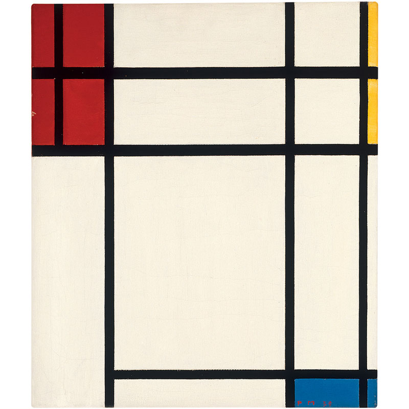
How do you think you can move and place different rectangles in the same billboard? If you figure out how, show off your skills by making a composition of rectangles and colors that resembles a Piet Mondrian painting.
-
どうすれば1つの描画領域に幾つかの違う長方形を動かして配置することができると思いますか。良い方法を考え出せたらモンドリアンの絵のようなパターンを作ってみせてください。
Circles
円
It's easy to draw squares on grid paper and rectangles on cartesian coordinates, but circles require another approach, especially since we need a "per-pixel" algorithm. One solution is to re-map the spatial coordinates so that we can use a step() function to draw a circle.
方眼紙の上やデカルト座標系で長方形を描くのは簡単です。しかし円を描くには別のアプローチが必要です。しかもシェーダーではそれぞれのピクセルごとに処理するアルゴリズムを用いなければなりません。1つの方法は step() 関数を使って円が描けるように、空間座標を置き換えることです。
How? Let's start by going back to math class and the grid paper, where we opened a compass to the radius of a circle, pressed one of the compass points at the center of the circle and then traced the edge of the circle with a simple spin.
どうすればいいのでしょう。数学の教室に戻って方眼紙の上にコンパスを半径の長さに開いたところから始めましょう。片方の端を円の中心に置いて一回転させて円の淵をなぞります。
Translating this to a shader where each square on the grid paper is a pixel implies asking each pixel (or thread) if it is inside the area of the circle. We do this by computing the distance from the pixel to the center of the circle.
シェーダーでは方眼のマス目の1つ1つがピクセルに対応します。方眼紙とコンパスからシェーダーに置き換えるということは、それぞれのピクセル(スレッド)に対して円の内側にあるかどうかを問い合わせることを意味します。これは円の中心からピクセルまでの距離を計算することで行うことができます。
There are several ways to calculate that distance. The easiest one uses the distance() function, which internally computes the length() of the difference between two points (in our case the pixel coordinate and the center of the canvas). The length() function is nothing but a shortcut of the hypotenuse equation that uses square root (sqrt()) internally.
距離を計算するには幾つかの方法があります。最も簡単なのは distance() 関数を使うことです。この関数は内部的に2つの点の差を取りその length() を計算します(今回のケースではピクセルの座標と描画領域の中心が対象です)。length() 関数は ピタゴラスの定理
You can use distance(), length() or sqrt() to calculate the distance to the center of the billboard. The following code contains these three functions and the non-surprising fact that each one returns exactly same result.
- Comment and uncomment lines to try the different ways to get the same result.
In the previous example we map the distance to the center of the billboard to the color brightness of the pixel. The closer a pixel is to the center, the lower (darker) value it has. Notice that the values don't get too high because from the center ( vec2(0.5, 0.5) ) the maximum distance barely goes over 0.5. Contemplate this map and think:
-
What you can infer from it?
-
How we can use this to draw a circle?
-
Modify the above code in order to contain the entire circular gradient inside the canvas.
Distance field
We can also think of the above example as an altitude map, where darker implies taller. The gradient shows us something similar to the pattern made by a cone. Imagine yourself on the top of that cone. The horizontal distance to the edge of the cone is 0.5. This will be constant in all directions. By choosing where to “cut” the cone you will get a bigger or smaller circular surface.
Basically we are using a re-interpretation of the space (based on the distance to the center) to make shapes. This technique is known as a “distance field” and is used in different ways from font outlines to 3D graphics.
Try the following exercises:
-
Use
step()to turn everything above 0.5 to white and everything below to 0.0. -
Inverse the colors of the background and foreground.
-
Using
smoothstep(), experiment with different values to get nice smooth borders on your circle. -
Once you are happy with an implementation, make a function of it that you can reuse in the future.
-
Add color to the circle.
-
Can you animate your circle to grow and shrink, simulating a beating heart? (You can get some inspiration from the animation in the previous chapter.)
-
What about moving this circle? Can you move it and place different circles in a single billboard?
-
What happens if you combine distances fields together using different functions and operations?
pct = distance(st,vec2(0.4)) + distance(st,vec2(0.6));
pct = distance(st,vec2(0.4)) * distance(st,vec2(0.6));
pct = min(distance(st,vec2(0.4)),distance(st,vec2(0.6)));
pct = max(distance(st,vec2(0.4)),distance(st,vec2(0.6)));
pct = pow(distance(st,vec2(0.4)),distance(st,vec2(0.6)));
- Make three compositions using this technique. If they are animated, even better!
For your tool box
In terms of computational power the sqrt() function - and all the functions that depend on it - can be expensive. Here is another way to create a circular distance field by using dot() product.
Useful properties of a Distance Field
Distance fields can be used to draw almost everything. Obviously the more complex a shape is, the more complicated its equation will be, but once you have the formula to make distance fields of a particular shape it is very easy to combine and/or apply effects to it, like smooth edges and multiple outlines. Because of this, distance fields are popular in font rendering, like Mapbox GL Labels, Matt DesLauriers Material Design Fonts and as is describe on Chapter 7 of iPhone 3D Programming, O’Reilly.
Take a look at the following code.
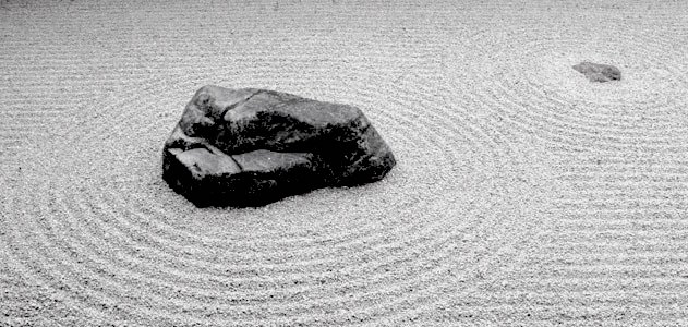
We start by moving the coordinate system to the center and shrinking it in half in order to remap the position values between -1 and 1. Also on line 24 we are visualizing the distance field values using a fract() function making it easy to see the pattern they create. The distance field pattern repeats over and over like rings in a Zen garden.
Let’s take a look at the distance field formula on line 19. There we are calculating the distance to the position on (.3,.3) or vec3(.3) in all four quadrants (that’s what abs() is doing there).
If you uncomment line 20, you will note that we are combining the distances to these four points using the min() to zero. The result produces an interesting new pattern.
Now try uncommenting line 21; we are doing the same but using the max() function. The result is a rectangle with rounded corners. Note how the rings of the distance field get smoother the further away they get from the center.
Finish uncommenting lines 27 to 29 one by one to understand the different uses of a distance field pattern.
Polar shapes
In the chapter about color we map the cartesian coordinates to polar coordinates by calculating the radius and angles of each pixel with the following formula:
    vec2 pos = vec2(0.5)-st;
    float r = length(pos)*2.0;
    float a = atan(pos.y,pos.x);
We use part of this formula at the beginning of the chapter to draw a circle. We calculated the distance to the center using length(). Now that we know about distance fields we can learn another way of drawing shapes using polar coordinates.
This technique is a little restrictive but very simple. It consists of changing the radius of a circle depending on the angle to achieve different shapes. How does the modulation work? Yes, using shaping functions!
Below you will find the same functions in the cartesian graph and in a polar coordinates shader example (between lines 21 and 25). Uncomment the functions one-by-one, paying attention the relationship between one coordinate system and the other.
Try to:
- Animate these shapes.
- Combine different shaping functions to cut holes in the shape to make flowers, snowflakes and gears.
- Use the
plot()function we were using in the Shaping Functions Chapter to draw just the contour.
Combining powers
Now that we've learned how to modulate the radius of a circle according to the angle using the atan() to draw different shapes, we can learn how use atan() with distance fields and apply all the tricks and effects possible with distance fields.
The trick will use the number of edges of a polygon to construct the distance field using polar coordinates. Check out the following code from Andrew Baldwin.
-
Using this example, make a function that inputs the position and number of corners of a desired shape and returns a distance field value.
-
Choose a geometric logo to replicate using distance fields.
Congratulations! You have made it through the rough part! Take a break and let these concepts settle - drawing simple shapes in Processing is easy but not here. In shader-land drawing shapes is twisted, and it can be exhausting to adapt to this new paradigm of coding.
Now that you know how to draw shapes I'm sure new ideas will pop into your mind. In the following chapter you will learn how to move, rotate and scale shapes. This will allow you to make compositions!


